OVERVIEW
Coffee shops are everywhere. Exploring coffee shops can be fun except for those who just want to quickly find a work spot. My goal is to find solutions and uncover pain-points people have when looking for the right coffee place.
TOOL
Figma
SCOPE
User Research, Information Architecture, Prototyping, Wireframing, Usability Testing, UI/UX Design
ROLE
UI/UX Designer
DURATION
April - August 2021
As a college student, I am always looking for a place to work at. While studying at home is comfortable, it can get a little too comfortable sometimes. On the other hand, school libraries can also have a tense and stressful atmosphere. With a relaxing and casual setting, a coffee shop is the medium choice between home and library.
“Coffee shops allow you to change the environment, bring new stimulation, and encourage inspiration. It’s all about a happy medium of ambient noise an average coffee shop has, which is 70 decibels: it influences productivity most, while 50 decibels are too quiet and 85 decibels – too loud for a happy work.”
Source: Why Working From Coffee Shops Makes You More Productive
---- PROBLEM
Information on coffee shops is scattered all over the internet, which makes the search process inefficient.
There are endless results when you search for coffee shops on Google or Yelp. There are also coffee shop lists put together by websites such as Eater, Time Out, and Thrillist. These platforms are perfect for users who want to take a quick look at the coffee shop and grab a cup of coffee. However, they are not so informational for users who are visiting for a specific purpose such as studying or working. Based on the interviews that I conducted with 5 participants, it usually takes them more than three steps to figure out whether a coffee shop is work-friendly, which is inconvenient and time-consuming.
---- SOLUTION
The app must be: effortless, personal, exciting
1. Include essential information such as Wifi, Charging Outlets, Time Limits, and Noise Level that helps users determine whether the place is work-friendly.
2. Provide customized features with filters and favorites tabs that cater to the users’ needs.
3. Inspire users with fun browsing experience with coffee shop lists such as New, Recommended, and Browse by Themes.
---- SECONDARY RESEARCH
Competitive Analysis
2 objectives for the competitive research and analysis:
Understand how users are currently looking for coffee shops with study purposes
Analyze the pros and cons of competitors who offer a similar service
From competitive research and analysis, I learned about how Instagram, Google Map, and Yelp helped to achieve users’ goals. I also found ways that these tools fell short in catering to the user’s needs and how I might potentially fix these pain points in my solution.
Pros: Logical display of information, save/collection option, use of the map to show proximity
Cons: Lack of information, difficulty to filter, random photos/ replies, outdated information
In order to look deeper into the problem space, I came up with the following HMW questions that serve as a guidance of the problems that I am trying to solve.
---- USER RESEARCH
16 Screener Survey Participants, 5 Interviews
Target Audience:
Age: 18 to 25
Mainly college students who need to get work done on their own time
Visit coffee shops very often (at least twice a week)
My goal for conducting user research was to go through the search process step by step and uncover any difficulties that users encounter. To find the right audience, I conducted a screener survey with 16 participants. Then, I conducted interviews with 5 of the participants to confirm the hypothesis: The app serves its purpose to a specific market group and goes beyond the tools that they have used. Information and filters on work-friendly aspects will also make their search process more efficient. These were the major questions that I wanted to get out of the interview:
What search tools do you use the most often and why do you choose them?
What is your search process like and how long does it take you?
What aspects do you value the most about a workspace?
I made an affinity map in order to identify common themes from the interviews.

Major Insights from User Feedback
---- Synthesizing Research
Empathy Mapping
I created an empathy map to depict an accurate picture of emotion phases throughout the search process. It would further help me bridge the gap between my persona and design concepts.
---- Synthesizing Research
User Persona- Meet Ben
I created a persona named Ben to have a better understanding of the user’s needs and goals. From my previous research, I identified one persona because the product appeals to a relatively small group of target audience.
---- Ideation
User Stories
After I gained a good understanding of my users, I created user stories to identify the functional needs of my product. Most importantly, I prioritized the user stories and identified the Minimum Viable Products (MVPs), which will help me quickly validate my hypothesis.
---- Information Architecture
User Flows
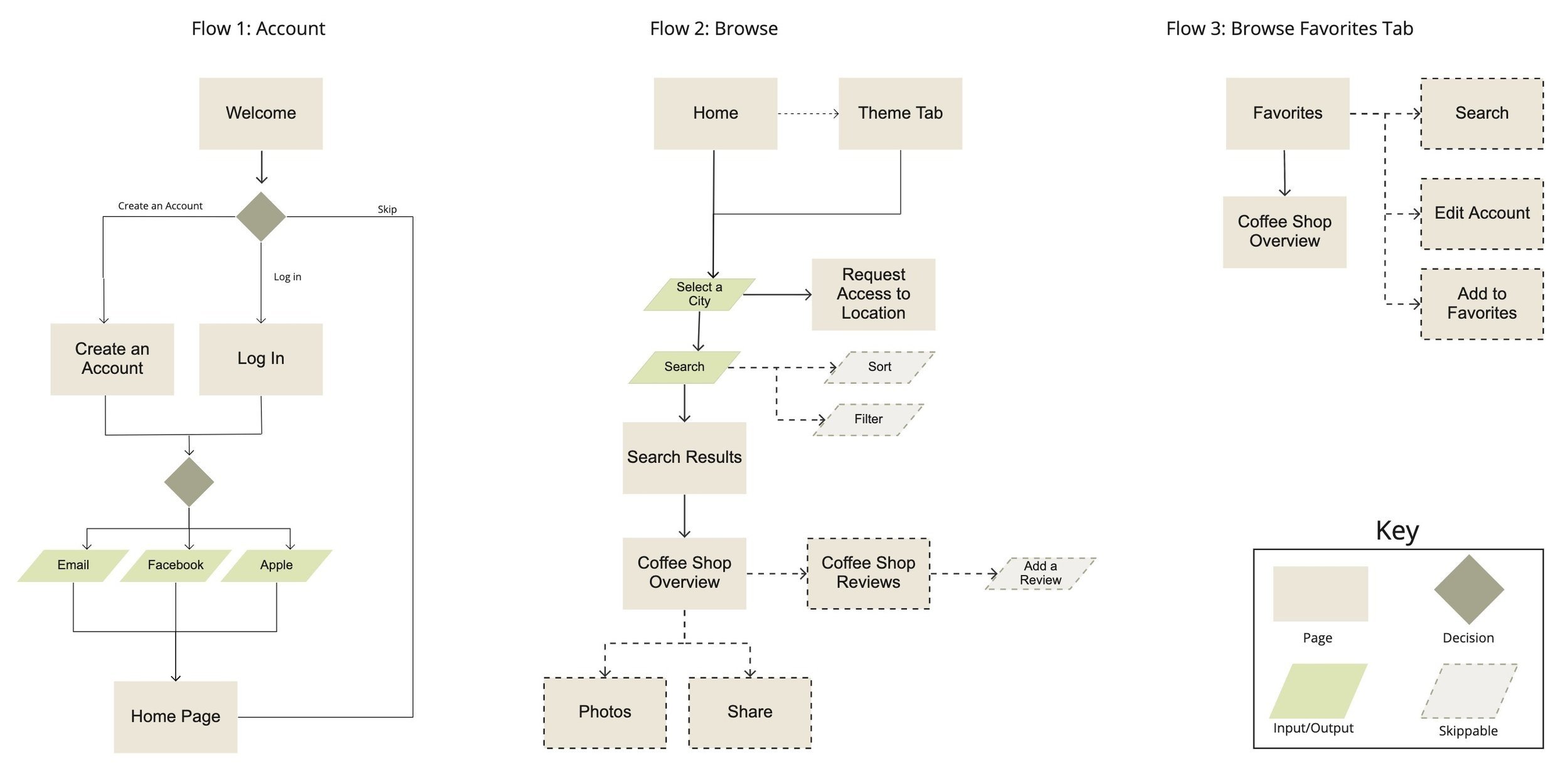
With the MVPs above, I selected three red routes that are critical to my design. I created separate user flows based on each red route to see how users will navigate and achieve these goals.
---- Sketches and Wireframes
Guerilla Usability Testing
After making sketches of the app, I conducted guerilla usability testing with 5 users to quickly flag areas of improvement and iterated based on the feedbacks I received from user testing. Below are the major changes I made when I turned my sketches into wireframes:
1. Combining Tabs with Similar Functions
Participants were confused about the functionality of Search Tab since there was already a Search Bar on the Home Page. They also did not expect to find the Browse by Themes feature under the Search Tab.
2. Reorganized Information Using Visual Hierarchy
When I asked the participants to find information regarding Wifi, Charging Outlet, and Time Limit, they intuitively searched under the Overview Tab. For solution, I placed these information in a noticeable place and made sure users are able to find critical information quickly.
Click Here to View Sketches Prototype
Click Here to View Wireframes Prototype
---- High Fidelity Prototype
Usability Testings
After transforming my wireframes into High Fidelity Mockups, I continued to iterate my designs for a month. I conducted two rounds of usability testing and talked to 10 users in total. Below were the major improvements that I made based on the insights I learned from the testings:
1. Improved Icon
Most users hesitated when they saw the time icon. They knew it was something about the time limit but they are not exactly sure. In order to solve this issue, I changed the icon into an hourglass. This was more intuitive for users because the hourglass itself symbolizes time countdown.
2. Added More Information on the Work Friendly Aspects of the Coffee Shops
Users felt like some key information to knowing whether the coffee shop is work friendly were missing. They wanted to know the noise level and price of the shop. They also want to visit during less crowded times. For that reason, I added a popular times table to help them learn more about the coffee shop and avoid the crowd.
---- High Fidelity Prototype
Final Product
---- Reflection
Challenges & Moving Forward
Grind was my first ever UI/UX Design project. This four-month journey has challenged me enormously and pushed me to grow as a new designer. I am incredibly happy to see my ideas come to life.
Throughout this project, I went through phases of design thinking: emphasize, define, ideate, prototype, and test. This was not a linear process as I found myself repeatedly going back and forth when I tried to figure out why some things do not work and how I can fix them. From this process, I have learned two main lessons that will help me become a better designer moving forward:
Listen to the Users
During this project, I conducted 4 rounds of interviews/ usability testing with a total of 20 users. Sometimes, I struggle to understand what the user really thinks or feels. In order to get the most out of each interview, I continued to learn how to conduct insightful interviews and communicate with users. More importantly, I learned to listen and observe. This allowed me to gain genuine feedback that directed me to areas that needed improvement.
Details matter
Iteration took almost a month and it was the longest process of this project. I learned that there was always space for improvement. Details are the most important part and they make a difference in the design. By paying attention to details, I aspire to elevate my work from meeting to exceeding expectations.
Acknowledgement
Thank you to my mentor, Izabela Bulska and the 20 users that participated in my interviews, who helped me make this project come to life together.
More Projects


