OVERVIEW
For my second capstone project, I took on a challenge from a startup company that launched a media product two years ago. It is a freemium model that has a mobile experience for both iOS and Android. The company’s business strategy is to offer a free product and evolve the features in order to monetize the premium product. My goal is to design an experience that will allow and incentivize users to subscribe and pay monthly/annually.
TOOL
Figma
SCOPE
UI/UX, Wireframing, Prototyping, User Testing
ROLE
Sole UX Designer
DURATION
September - November 2021
---- PROBLEM
Users who are currently using the freemium model have no incentive to subscribe.
Currently, Blues’ product has been well received and has a healthy user base of free users. However, there is no opportunity for new users to subscribe to the premium product upon registration in the signup flow. The existing flow also does not have prominent calls to action throughout the free experience that gives the user the opportunity — or a compelling reason — to subscribe.
---- SOLUTION
Subscription promotions integrated seamlessly throughout the app.
After synthesizing research, I came up with the following solutions that would incentivize users to subscribe.
1. Premium Benefits: A clear value proposition offered by Blues Premium and the deals and offers that are available to users.
2. Exclusive Features: Throughout the user’s browsing experience, the premium features are visible and “locked”. Subscription promotions are integrated as part of the flow.
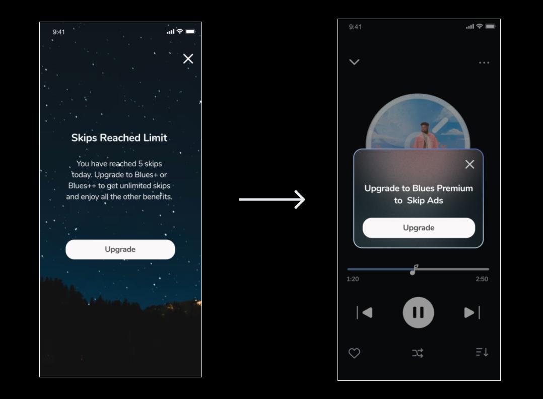
3. Need-Based Subscription Promotions: Subscription promotions pop up whenever a user tries to perform actions that are only available for Premium users.
---- SECONDARY RESEARCH
Competitive Analysis
I divided the competitive research and analysis into two parts:
Study the industry leaders
Explore other companies who have successful subscription products
For the first part, I looked at the leaders in the music streaming industry and focused on how they achieve similar business goals by analyzing their approach in selling the subscription plans.
In order to better my understanding of the subscription features, I conducted a secondary research on companies who may not be in the media industry but are successful in selling their subscriptions.
I created the following research questions to focus on during my research:
How do other companies sell the subscription and not annoy the users at the same time?
What are the value propositions that the companies are offering to the users?
How do other companies make the subscribing process easy and quick?
---- Discover
User Research
I selected 5 participants based on Blue’s target audience:
Age: 18 to 24
Very tech-savvy— they are on their phones for several hours a day
Very budget-conscious
Music is a very important part of their lives
My objective for conducting user research was to learn about users’ experience with subscription promotions. In addition, I wanted to confirm the hypothesis: A good balance of subscription promotions integrated in the app would serve its purpose to incentivize users to subscribe. These were the major questions that I wanted to get out of the interview:
What apps do you currently subscribe to and why did you choose to subscribe?
If you are currently using a freemium plan, why do you not subscribe to it?
Do you prefer less plans (1-2) that restrict your choices or more plans (3-4) that provide more versatility?
When you look at premium plans for music apps, what are some key factors that help you decide?
When you are using a music app, what are the moments that you wished you subscribed? If you already subscribed to it, what are the moments that made you happy that you subscribed?
---- Synthesizing Research
Empathy Mapping
I created an empathy map to depict an accurate picture of the emotional phases throughout the browsing process.
---- Information Architecture
User Flows
Based on the informational interviews that I conducted with 5 users, I selected four red routes that are critical to my design. I created separate user flows based on each red route, where the users will encounter the subscription promotions.
---- Sketches & High Fidelity Prototype
Usability Testing Round I
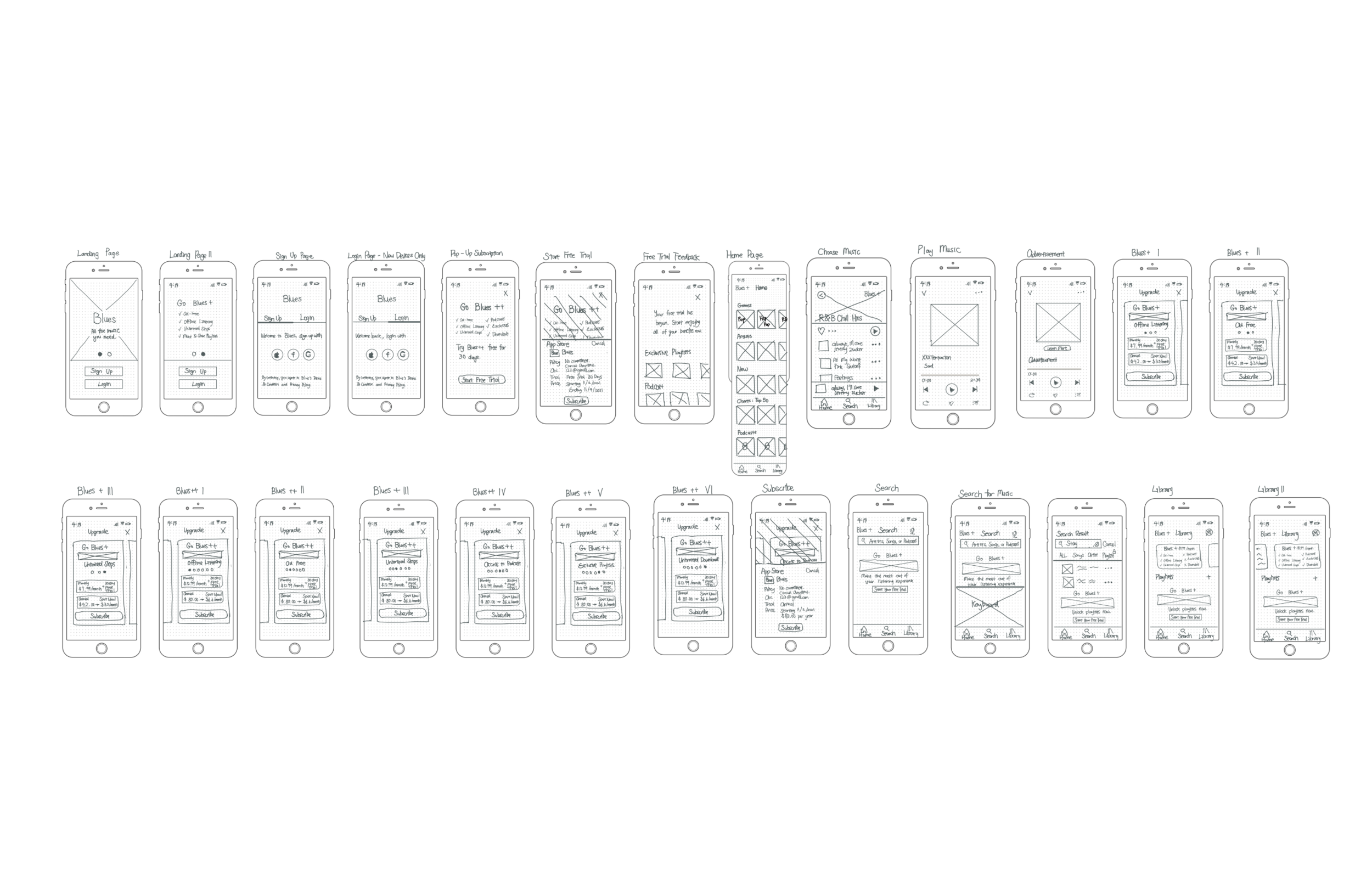
I began my design by focusing on the display of subscription promotions. My goal was not only to allow the users to notice them but also promote the right feature at the right moment. Based on the information that I have gathered in the user research, timing and display of subscriptions play key roles in advertising.

After completing my sketches, I turned them into a high fidelity prototype. I conducted guerilla usability testing with 5 users to quickly flag areas of improvement. The startup has requested me to focus on the subscription aspect of the project. Therefore, my goal for usability testing is to confirm whether my designs create an experience that will allow and incentivize users to subscribe. Below were the major improvements that I made based on the insights I learned from the testings:
1. Improved Delivery of Pop Up Subscription Pages
The pop up brings the user to another page, which means the user has to return to the previous page. They do not like the display of these pop ups and also how they take up the entire page. I fixed this issue by minimizing the pop up and moved it to the current page that the user is on. The promotion continues to serve its purpose without taking up too much space.
2. Simplified Subscription Plans
The users have to put a lot of effort to swipe between the two subscription plans. They also have trouble noticing the check marks. I fixed this issue by limiting it to one subscription, where all the features are displayed in one place. I also highlighted the features visually in order to make the plans easier to read.
Usability Testings Round II
After more iterations based on the first round of testing, I conducted a second round of usability testing with 5 more users. Below were the major improvements that I made based on the insights I learned from the second round of testings:
1. Integrated Pop Up Banners
The users find the banners annoying because they seem random and out of nowhere. Instead of placing the banners on the top, I integrated them in the app based on the features. In this way, the advertisement appears less aggressive and more relevant.
2. Efficient Onboarding Flow
The landing page includes paginations with premium features. Instead of checking out the features, users immediately tried to sign up once they arrived on the landing page. The promotions did not fully serve their purpose. In order to fix this, I moved the screens after the sign up page, which directed users’ attention to one thing at a time.
---- Visual Design
Brand Personality & Style Guide
---- Reflection
Challenges & Moving Forward
In my first two projects, I have focused and practiced an array of skills in UI/UX design. Before I started working on this project, I created a project plan. It allowed me to carefully think through the decisions and methods that I will incorporate into my solution. In order to come up with the optimal solution, I constantly revisited the company’s problem space. These were the main challenges that I encountered and how I solved them:
Less is More
As I fully understood the company’s goal and strategy to promote the subscriptions, I tried to sell the subscription whenever I could. I also tried to shove as much information as possible to the users. The outcome was not ideal as many users found the amount of information difficult to process and even kind of intimidating. This was a valuable lesson where I learned that sometimes less is more. I found a good balance by reducing content and highlighting the most important message.
Delivery is Key
Another challenge that I faced was not being able to grab the users’ attention when I tried to promote certain features. I created a value proposition but sometimes it failed to serve its purpose to promote. I have learned the importance of delivering content and messages. I improved the delivery of my solution by adjusting the display and placement of content to be more intentional and relevant.
Acknowledgement
Thank you to my mentor, Izabela Bulska and the 15 users that participated in my interviews, who helped me make this project come to life together.
More Projects


